| HTML | CSS |
|---|---|
| Structure | Design |
| Client-side, browser organizes markup | Client-side, browser visualizes design |
| Hyper Text Markup Language describes the various components of a web document. | Cascading Style Sheets stylize the elements in a web document. |
CSS
Cascading Style Sheets
Describe how you want content to look. It applies design to your html elements.
selector {property: value;}
OR
selector {
  property: value;
  property: value;
  property: value;
}
CSS
Attaching Styles
- Inline Styles
- Embedded Style Sheets
- External Style Sheets
CSS
Formatting Text
Color and Background Properties
Flow and Layout
Animation
CSS
Grouped Selectors
You can apply properties and values to multiple elements using a grouped selector.
h1, h2, p, img {
  border: 1px solid #999;
}
Color tools: Color Picker; Adobe Color
CSS
ID Selectors
<h1 id="intro">Introduction</h1>


#intro {
  color: #990000;
}
Color tools: Color Picker; Adobe Color
CSS
Class Selectors
<p class="alert">Error</p>


.alert {
  color: #990000;
}
Color tools: Color Picker; Adobe Color
CSS
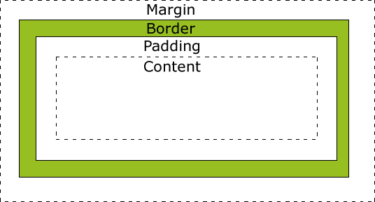
The Element Box
Content: The actual text or image or content
Padding: The area between the content area and an optional border
Border: A line that surrounds the element and padding
Margin: The area outside the border
For each padding, border and margin you may define values for top, right, bottom and left sides.
CSS
The Element Box
CSS
The Element Box
CSS
The Element Box
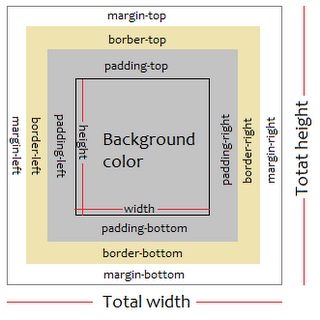
Width and Height
Properties to specify the dimensions or content area of an element. You can specify the width and height of block-level elements and non-text inline elements such as images.
#mydiv {
  width: 500px;
  height: 200px;
  margin: 10px;
  border: 1px;
  padding: 5px;
}
CSS
The Element Box
By default, the width & height of an element is calculated as:
width + padding + border = actual width of an element
height + padding + border = actual height of an element
So when you set the width/height of an element, the element often appears bigger than you have set, because the element's border and padding are added to the element's specified width/height.
CSS
The Element Box
The box-sizing property allows us to include the padding and border in an element's total width and height.
The * universal selector selects all elements. The code below is the common initial declaration to establish manageable and predictable layout.
* {
  box-sizing: border-box;
}
CSS3
CSS Positioning
A div (short for division) is a generic block element or container that can be customized using CSS or JavaScript.
You give a generic element a name using either an id or class attribute.
A span is a generic inline element or container that can be customized using CSS or JavaScript.
You give a generic element a name using either an id or class attribute.
CSS3
CSS Positioning - Float
The float property moves an element as far as possible to the left or right, allowing the following content to wrap around it. Possible values include: left, right, none, inherit. It is necessary to specify the width for floated text elements. (Example below uses class box, but a div tag could be used.)
.box {
  float: left;
  width: 200px;
  height: 160px;
  margin-right: 15px;
  padding: 5px;
}
CSS3
CSS position property indicates how an element is to be positioned. The types include:
- static: Normal positioning scheme (default)
- relative: Moves the box relative to its original position in the flow of the document.
- absolute: Elments are removed from the document flow entirely and are positioned relative to a containing element.
- fixed: The element stays in one position in the window even when the document scrolls.
CSS3
CSS Positioning
- sticky: is positioned based on the user's scroll position.
A sticky element toggles between relative and fixed, depending on the scroll position. It is positioned relative until a given offset position is met in the viewport - then it "sticks" in place (like position:fixed). Not supported by Internet Explorer, Edge 15 and earlier versions; Safari requires a -webkit- prefix. You must also specify at least one of top, right, bottom or left for sticky positioning to work. w3schools.com
CSS3
CSS Positioning - Grid
.grid {
  display: grid;
  grid-template-columns: repeat(4, 255);
  grid-column-gap: 10px;
  /* fr is a fraction */
  grid-template-rows: repeat(2, 1fr);
  grid-row-gap: 10px;
  /* vh - view height; vw - view width */
  min-height: 90vh;
  }
Media Queries
Media Query uses the @media rule to prescribe page properties when certain conditions are true. For example max-width: 500px might be a break point that alters the design of a site so that it looks and works better on a 500px viewport.
There are CSS frameworks that have media queries built in, perhaps the most popular is Bootstrap, a flexible, responsive, mobile first 12 column grid framework.
Web Fonts
Traditionally, typography on the web is determined by common fonts available on a user's computer or the use of images for more decorative and intereating fonts. This is no longer the case as various companies provide typefaces available via the web.
For example - Google Fonts