Grid and Flexbox
"The basic difference between CSS Grid Layout and CSS Flexbox Layout is that flexbox was designed for layout in one dimension - either a row or a column (x or y). Grid was designed for two-dimensional layout - rows, and columns at the same time. The two specifications share some common features..."
- MDN web docs
Using display: flex or display:flex and flex-direction: row
Using display:flex and flex-direction: column
Using display:grid
Flexbox
The flex-direction property defines in which direction the container wants to stack the flex items - either flex-direction: row or flex-direction: column. Flexbox will keep columns and row intact even if the viewport is too small for the content, however, by using flex-wrap property you may breakout a row into multiple rows for smaller screens.
-
Key flexbox properties:
display: flex;- turns element into a flex containerflex-direction: column;- OR -row- direction container stacks items.row-reverseright to left andcolumn-reversebottom to topflex-wrap: nowrap;- default;wrapallows items to wrap (create a new row);wrap-reverse- reverse order- Horizontal alignment:
justify-content: space-between;or alternatelyspace-aroundorcenter - Vertical alignment:
align-items: flex-start(top),flex-end(bottom),center; default-flex-stretch(not needed) - Perfect centering:
justify-content: center; align-items;if parent container usesdisplay: flexyou can just usemargin: auto;for children elements - Other properties are available, i.e. flex-flow, order...
Read all about CSS Flexbox.
CSS Grid
A grid is an intersecting set of horizontal and vertical lines - one set defining columns and the other rows. Elements can be placed onto the grid, respecting these column and row lines.
How Grid Layout Works
The process for using the CSS Grid Layout Module is fundamentally simple:
- Use the display property to turn an element into a grid container. The element's children automatically become grid items.
- Set up the columns and rows for the grid. You can set them up explicitly and/or provide directions for how rows and columns should get created on the fly (the css grid is very flexible).
- Assign each grid item to an area on the grid. If you don't assign them explicitly, they flow into the cells sequentially.
The element that has the display: grid property applied to it becomes the grid container and defines the context for grid formatting. All of its direct child elements automatically become grid items that end up positioned in the grid. You can define an explicit grid with grid layout but the specification also deals with the content added outside of a declared grid, which adds additional rows and columns when needed. Features such as adding "as many columns that will fit into a container" are included.
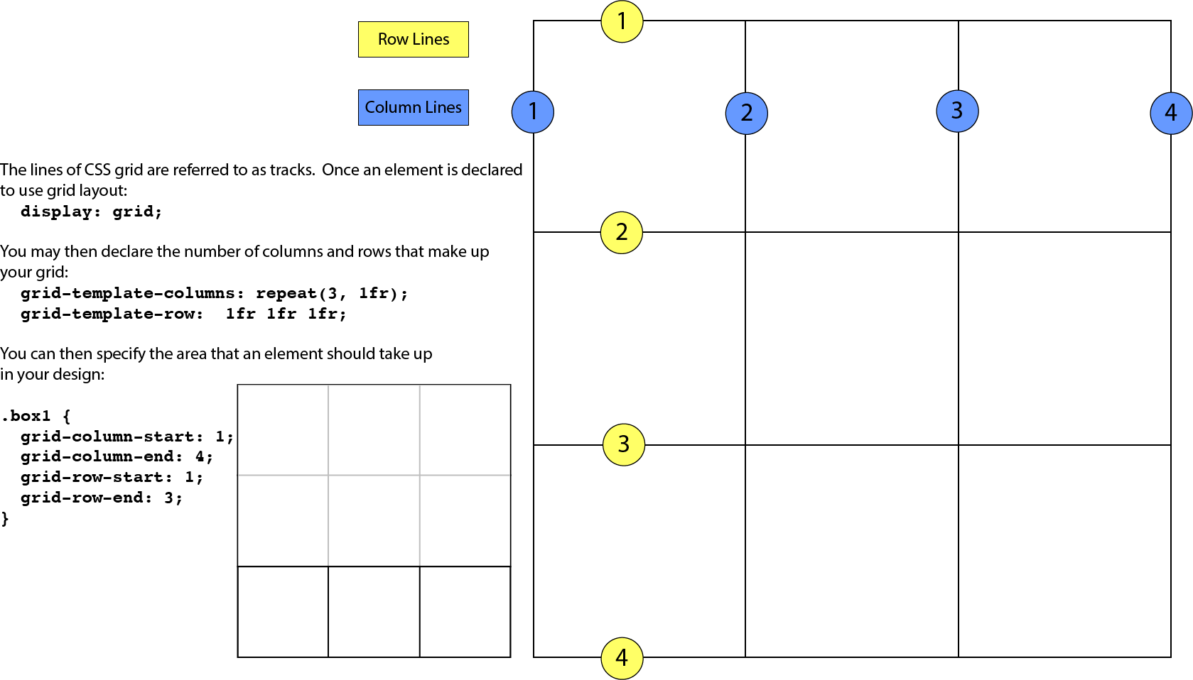
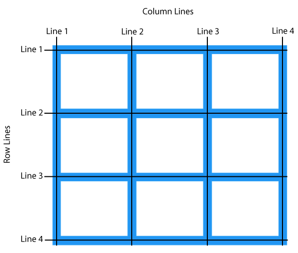
Grid line
The horizontal and vertical dividing lines of the grid are called grid lines.
Grid cell
The smallest unit of a grid is a grid cell, which is bordered by four adjacent grid lines with no grid lines running through it.
Grid area
A grid area is a rectangular area made up of one or more adjacent grid cells.
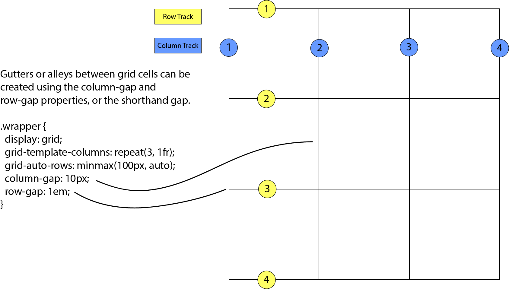
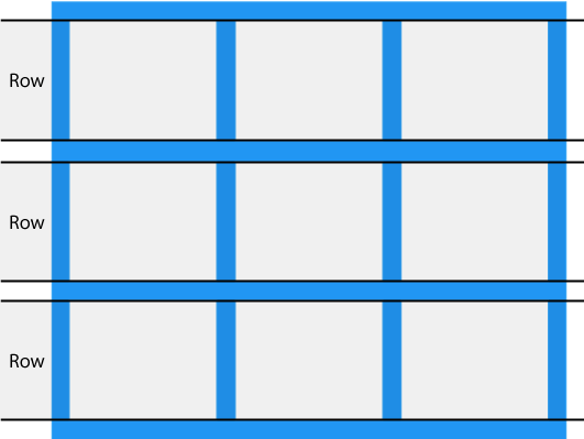
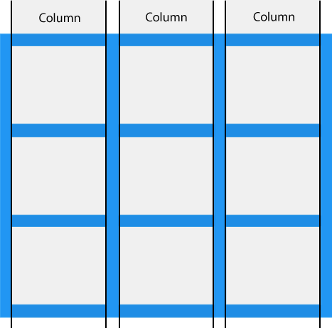
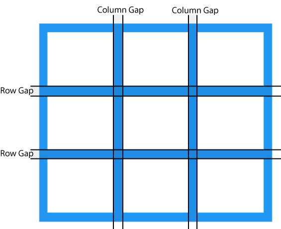
Grid track
The space between two adjacent grid lines is a grid track, which is a generic name for a grid column or a grid row. Grid columns are said to go along the block axis, which is vertical (as block elements are stacked) for languages written horizontally. Grid rows follow the inline (horizontal) axis.
The structure established for the grid is independent from the number of grid items in the container. You could place 4 grid items in a grid with 12 cells, leaving 8 of the cells as 'whitespace.' That's the flexibility of grids. You can also set up a grid with fewer cells than grid items, and the browser adds cells to the grid to accommodate them.